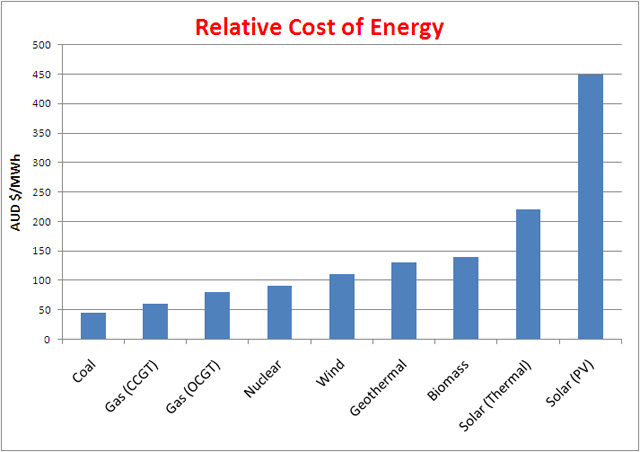
I created the chart myself and am the original source. Use it as you see fit. I price electricity for a living, but aggregated a number of sources to reduce bias in order to create this chart:
Sources:
1. AGL energy (“The hidden costs of wind generation in a thermal power system: what cost?” see “Figure 1: LRMC of Generating Plant in the NEM (ex Carbon)”)
2. International Energy Agency (IEA) (“Executive Summary”)
3. ACIL Tasman consultants (“Fuel resource, new entry and generation costs in the NEM” – see “Table 52 LRMC for new entrant technologies by NEM zone excluding carbon costs”)
4. Me (I throw my 2 cents worth in, for what it’s worth, and probably not much, as another source. To be fair, it’s not just my perspective, but others I converse with in the energy industry, but, granted, it’s still just another opinion)

Can you provide the address of the website this chart came from?
Sure thing, Henry.
I created the chart myself and am the original source. Use it as you see fit. I price electricity for a living, but aggregated a number of sources to reduce bias in order to create this chart:
Sources:
1. AGL energy (“The hidden costs of wind generation in a thermal power system: what cost?” see “Figure 1: LRMC of Generating Plant in the NEM (ex Carbon)”)
2. International Energy Agency (IEA) (“Executive Summary”)
3. ACIL Tasman consultants (“Fuel resource, new entry and generation costs in the NEM” – see “Table 52 LRMC for new entrant technologies by NEM zone excluding carbon costs”)
4. Me (I throw my 2 cents worth in, for what it’s worth, and probably not much, as another source. To be fair, it’s not just my perspective, but others I converse with in the energy industry, but, granted, it’s still just another opinion)